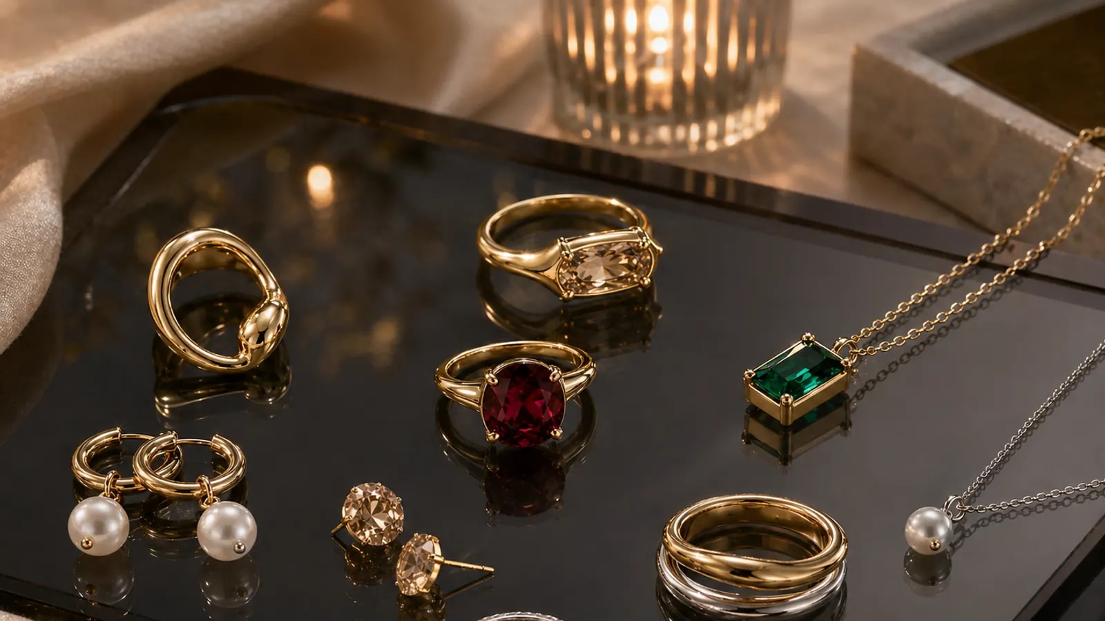
Why are darker capsule directions harder to merchandise?
High-contrast or mood-driven collections often photograph beautifully but raise more practical questions during purchase. Shoppers want to know how the pieces wear, what they pair with, and whether the finish is everyday or occasion-led.
That means the copy and support structure have to do more work. Darker or more directional pieces need clearer styling advice because the shopper cannot rely on broad familiarity the way they can with a simpler daily chain or stud.
The strongest preview content should therefore do two jobs at once: keep the atmosphere intact and translate it into real wearing occasions.
How should shoppers approach a more directional capsule?
Start with one piece that carries the concept cleanly. A shopper does not need the whole story at once; they need an anchor item that makes the rest of the collection legible.
Once the anchor exists, support content can show how to soften, intensify, or restyle the concept depending on the wardrobe. That turns a potentially intimidating collection into a series of usable entry points.
This is where the journal matters: it can teach the shopper how to buy the mood without feeling trapped inside it.
What should happen after the preview?
A preview should route readers either to the collection when it is live or to related education when it is not. Dead-end editorial wastes the interest it creates.
If the capsule is still in development, the best follow-up is often a journal section page, a creator page, or the custom hub, depending on whether the shopper wants to browse, learn, or build something adjacent.
Good merchandising closes the gap between intrigue and action. That is the real job of a capsule preview.